Help Shoppers Explore Your Main Collections
Place collection tabs on your homepage to introduce key product categories. Shoppers can switch groups and open product pages without leaving the section.

Help shoppers browse products from different collections in one space. Use clickable collection tabs and image sliders to make exploring your Shopify store simple on any screen.
 2.0 Compatible
Tabbed Collection Browsing
Mobile-Friendly Slider
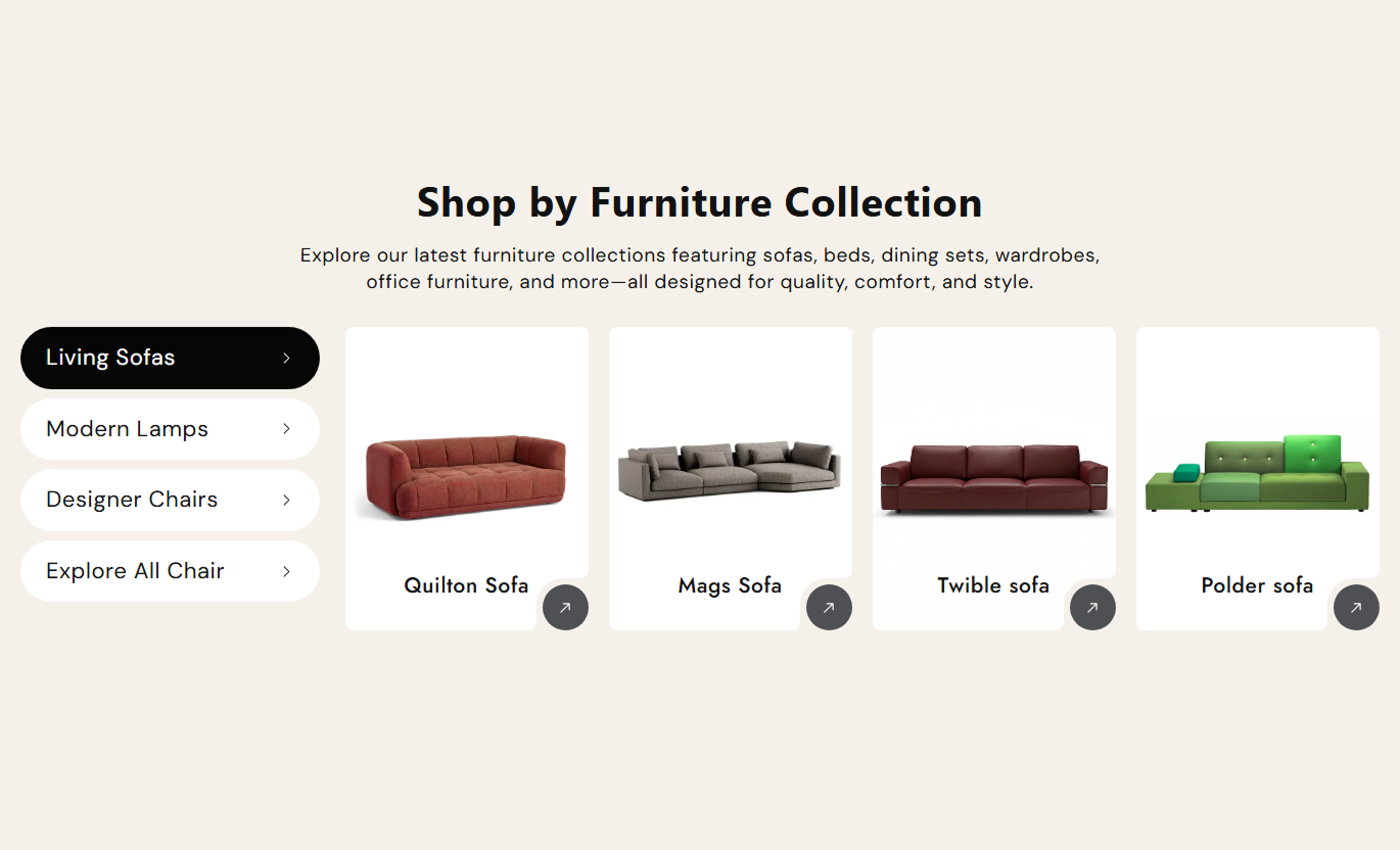
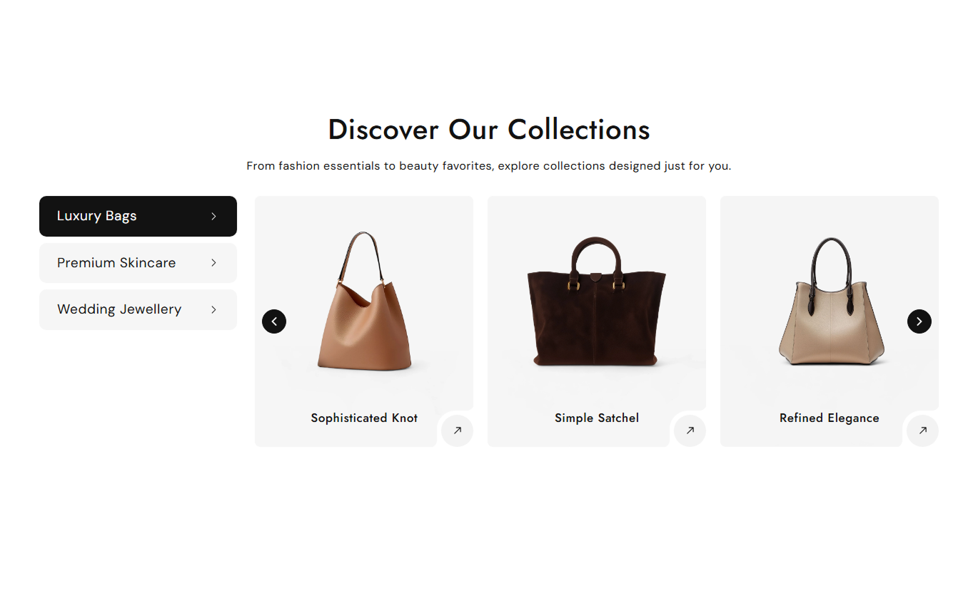


Display products from multiple Shopify collections in one interactive section, with collection tabs, image sliders, flexible layouts, and customizable controls.

Let shoppers switch between selected collections without leaving the page, keeping product browsing in one place.

Show up to eight products from each selected Shopify collection, using their existing featured images and product titles.

Give every product image a direct link to its product page, so shoppers can move from browsing to product details.

Choose how many product cards appear at once, with two to five on desktop and one or two on mobile screens.

Set the product slider to move automatically, choose its timing, and turn continuous looping on or off.

Rename each collection tab to suit your storefront while keeping products associated with the selected collection.

Use vertical collection tabs on desktop and a compact dropdown on smaller screens to keep navigation easy.

Adjust backgrounds, text, arrows, image corners, and section spacing to fit your Shopify store's visual style.
Manage collection tabs, product sliders, display settings, colors, and responsive layouts in your theme editor.

Applies to the whole section
Display a main title above the collection slider.
Section Heading TextAdd a supporting copy below the main heading.
Section Description TextSet separate text alignment for desktop and mobile.
Content Text AlignmentChoose small, medium, or large product image proportions.
Product Media HeightTurn automatic sliding on or off for product cards.
Slider Autoplay ControlKeep the product slider cycling continuously.
Continuous Slider LoopSet the slider's automatic movement interval.
Slider Autoplay SpeedChoose two to five product cards per desktop view.
Desktop Slider ColumnsChoose one or two product cards per mobile view.
Mobile Slider ColumnsSet a full-width layout or a custom section width.
Section Width Settings
Applies to each collection tab
Choose the Shopify collection displayed in this tab.
Select collectionEnter the name displayed in the collection navigation.
Tab titleAdd a tabbed collection slider to key Shopify pages so customers can compare product groups, discover relevant items, and explore your catalog without extra clicks.
Place collection tabs on your homepage to introduce key product categories. Shoppers can switch groups and open product pages without leaving the section.
Show popular product groups together in one clear areaHelp first-time visitors understand your store's rangeGuide shoppers toward seasonal or featured collectionsKeep the homepage tidy while displaying more productsMake it easy to explore products without new page loadsUse collection tabs to bring related product ranges together on a collection page. Visitors can check other groups and follow product links directly.
Introduce neighboring categories without a long link listShow products from related collections in one sliderGive visitors more options when a category feels limitedKeep browsing focused within a familiar page layoutMake product exploration easier on crowded catalogsAdd a collection slider below product details to display matching ranges or alternatives. Shoppers can open relevant items while reviewing the current product.
Present complementary product ranges near the itemShow alternatives without changing the main productSupport outfit, set, or accessory discovery visuallyLead visitors to relevant product detail pagesUse fewer separate sections for related product groupsGroup campaign collections on a landing page using clear tabs and product images. Visitors can browse each promoted range and open items that interest them.
Separate promotional categories with simple labelsShow campaign products without stacking long gridsHelp visitors jump between different product themesKeep the campaign page easy to browse on mobileConnect featured product cards to their product pagesMake more of your catalog visible in one section. Collection tabs keep categories organized, while image sliders give shoppers a direct path to individual items.
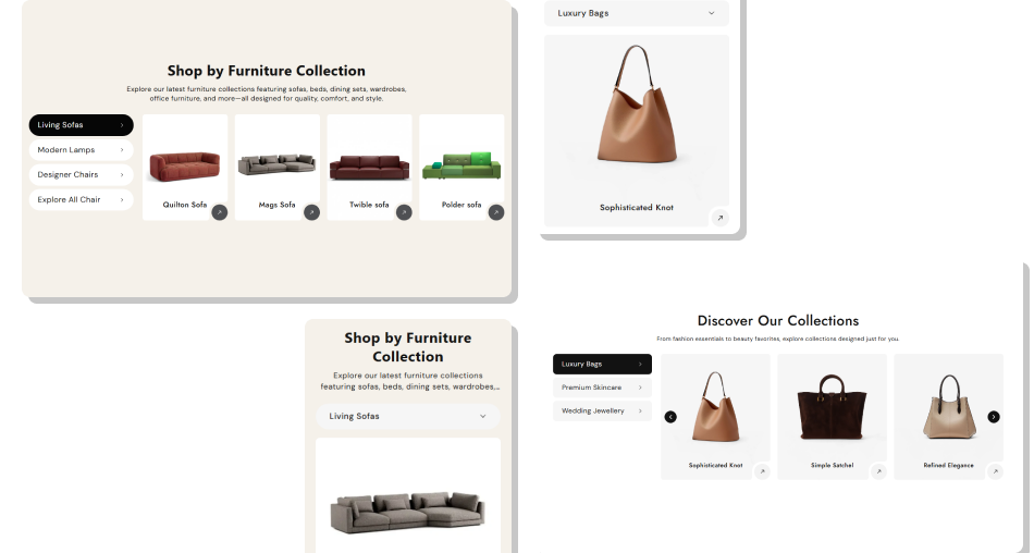
Bring related collections into a single space so visitors can explore different product groups without scrolling through separate grids.
Keep several collections in one compact storefront sectionHelp visitors find products by switching clear category tabsReuse existing Shopify product photos, titles, and linksAdjust slider movement to fit the way your customers browseChoose separate desktop and mobile product card layoutsStyle navigation and spacing to match your store designGive every displayed product a link to its detail page Choose collections that help shoppers compare related items.
Keep collection tab names short and easy to recognize.
Use consistent featured images across product collections.
Check the slider layout on both desktop and mobile screens.
Keep autoplay timing comfortable for reading product names.
 Add unrelated collections just to fill every available tab.
Use vague tab labels that hide what each group contains.
Mix poorly cropped product photos with polished imagery.
Show too many desktop product cards for your page width.
Set fast autoplay that moves products before they are read.
Open the section in the Shopify theme editor, add a Collection Tab block, and select the collection you want to display. You can add up to five tabs.
Yes. The section pulls up to eight products from each collection and displays their featured images and titles. Each product card links to its product page.
Yes. Each Collection Tab block includes a Tab title field. Enter a custom label or leave it blank to use the selected collection's name.
Yes. Set the desktop slider to show two to five products at once, and choose one or two columns for mobile screens in the section settings.
Yes. You can enable autoplay and looping, set autoplay speed from one to ten seconds, and choose whether desktop navigation arrows are shown.
On wider screens, the section displays vertical collection tabs. On smaller screens, those tabs become a dropdown, and the slider uses pagination dots.
Yes. The section includes settings for text, backgrounds, tabs, arrow colors, image corner radius, media height, width, and desktop and mobile padding.
Yes, on compatible Online Store 2.0 theme templates where the section is available. Add it through the theme editor and choose the collections for each tab.
For Support or any Questions Email Us: [email protected]
Install SectionHub and add the Tabbed Collection Slider section to your theme in minutes - no coding required.