Showcase Popular Collections and Featured Products
Use collection tabs on your homepage to introduce popular product ranges. Highlight one important item with a larger gallery while keeping other products easy to browse.

Showcase multiple Shopify collections with interactive tabs, product grids, and a featured product spotlight. Help shoppers explore items, view prices, and add products to cart with ease.
 2.0 Compatible
Interactive Collection Tabs
Featured Product Spotlight
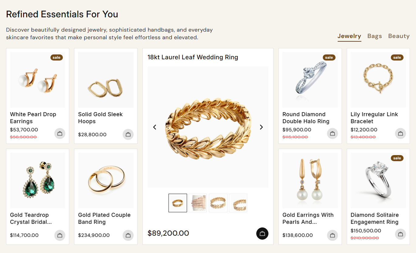
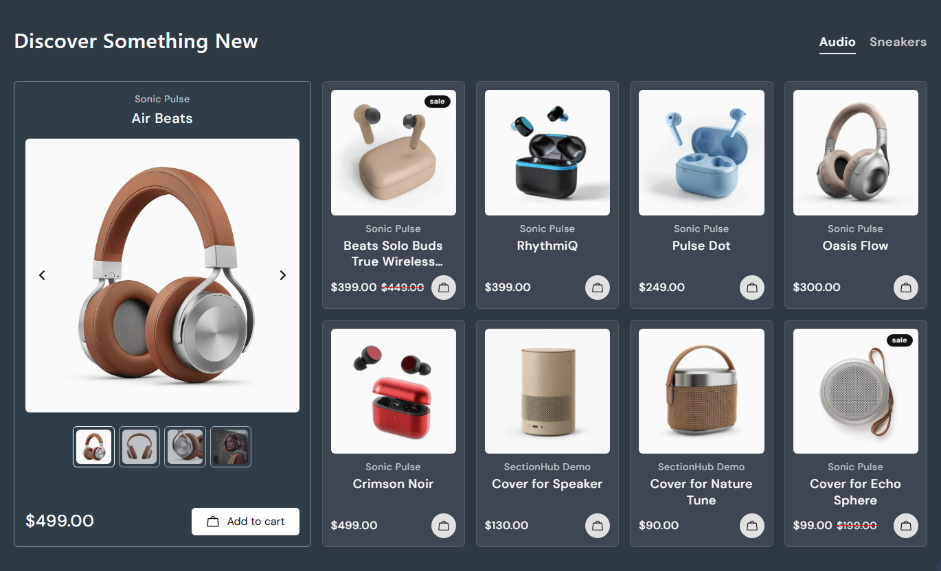
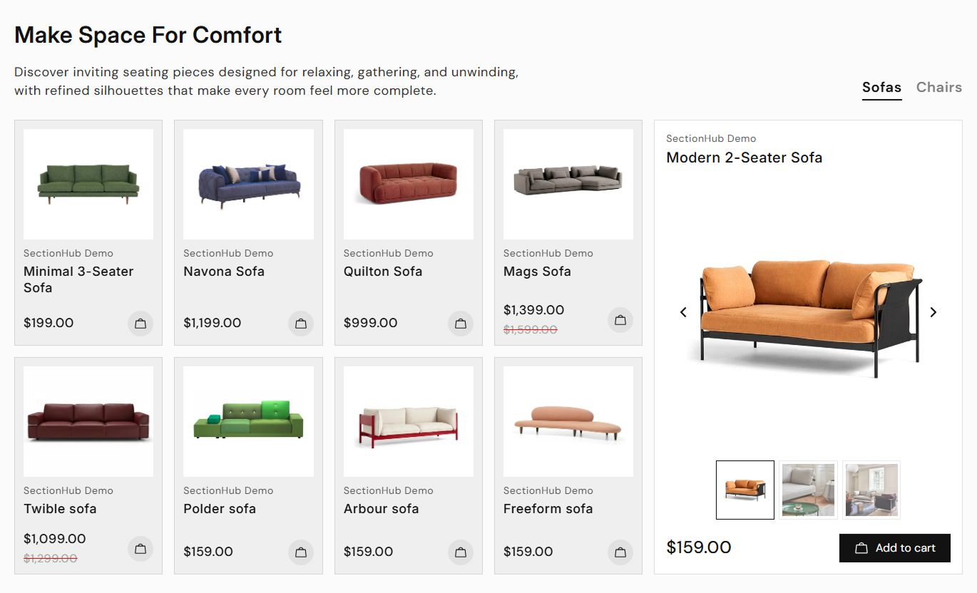


Show products from multiple collections with clickable tabs, a featured product gallery, sale badges, direct cart buttons, and responsive shopping layouts.

Let shoppers switch between selected Shopify collections without leaving the page, displaying a separate product grid for each tab.

Highlight a selected product in a larger card with its images, price, and purchase button alongside the regular collection products.

Show multiple images of the featured product with a main image slider and clickable thumbnails to make product exploration easier.

Give shoppers direct add-to-cart buttons on product cards, so they can add the first available variant without opening the product page.

Reveal a second product image when visitors hover over a regular product card, provided the product has multiple images available.

Show product prices, compare-at prices, and optional sale badges with custom text or automatically calculated discount percentages.

Display regular product cards in a swipeable mobile slider when a featured product is present, keeping the collection layout easy to browse.

Adjust product colors, text sizes, card borders, shadows, cart icons, and button styles to match your Shopify store's design.
Customize collection tabs, product cards, featured product displays, cart buttons, sale badges, and responsive layouts.

Applies to the whole section
Add a heading to introduce your featured collections.
Section Heading TextAdd supporting text above the collection product grid.
Section Description TextShow or hide sale badges on discounted product cards.
Sale Badge DisplayEnter custom sale text or use calculated discounts.
Sale Badge Text SettingsShow or hide the vendor name on product cards.
Product Vendor DisplayEnable add-to-cart buttons on regular product cards.
Add to Cart ControlsSet the featured product button text and appearance.
Featured Button StylingAdjust product card backgrounds, borders, and shadows.
Product Card AppearanceCustomize heading, product, price, and tab text sizes.
Product Typography SizeSet section width and separate desktop and mobile padding.
Responsive Section Layout
Applies to each collection tab
Enter a custom name for the collection navigation tab.
Collection Tab TitleChoose the Shopify collection to display in the grid.
Select CollectionChoose a product to highlight in the larger product card.
Featured ProductPosition the featured card to the left, center, or right.
Featured Card AlignmentAdd interactive collection tabs and product spotlights to important store pages to feature popular items, promote collections, and make shopping more convenient.
Use collection tabs on your homepage to introduce popular product ranges. Highlight one important item with a larger gallery while keeping other products easy to browse.
Introduce popular collections within one shopping sectionGive bestselling or featured products more visual spaceHelp visitors compare products from different categoriesDisplay product prices and discounts directly on the pageLet shoppers add products to cart from the homepage gridAdd a featured collection section to display related product categories on a collection page. Use tabs to organize ranges and spotlight selected products.
Connect shoppers with related product collections easilyHighlight a key product from a selected category rangeShow alternative product options without extra page visitsDisplay collection products with clear pricing informationGive shoppers quick access to relevant product pagesPlace a tabbed collection grid below product details to introduce related ranges and selected items. Give visitors more products to explore before leaving the page.
Introduce related collections near the current productHighlight a complementary item with multiple product imagesDisplay additional product choices in organized category tabsHelp customers explore other products with visible pricesProvide add-to-cart options for displayed product variantsUse collection tabs on promotional landing pages to organize campaign products. Feature a selected item with an image gallery and show other products with prices.
Group promotional products under clear collection tabsGive a campaign's main product a larger visual displayHighlight discounted items with optional sale badgesKeep multiple campaign categories in one organized areaLet visitors browse and add products from the campaignBring product collections, detailed featured-product images, and cart buttons into a single section. Help shoppers explore available items without switching pages.
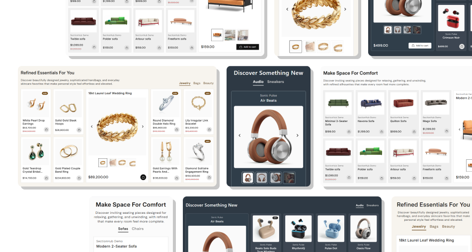
Organize collections with clickable tabs, give selected products extra attention, and keep prices and purchase actions nearby.
Display up to five collection tabs within one storefront sectionHighlight selected products with larger image galleriesShow product titles, vendor names, and current pricesDisplay discounted prices and customizable sale badgesAdd products directly to cart using available variant optionsCustomize product card styling and featured card positionsSupport mobile browsing with scrollable tabs and product sliders Choose collections with enough products for a balanced grid.
Feature products with several clear, high-quality images.
Use short collection tab names that customers can recognize.
Keep product prices and sale badges easy to read.
Test featured galleries and add-to-cart buttons on mobile.
 Select unrelated products that do not fit the collection.
Use blurry or inconsistent images across product cards.
Add long tab names that crowd the mobile navigation area.
Display misleading sale labels on discounted products.
Use low-contrast colors for prices, buttons, or product names.
You can add up to five collection blocks. Each block has its own tab title, selected Shopify collection, optional featured product, and card alignment.
Open a collection block in the theme editor and select a product in the Featured Product setting. The larger card appears when the collection has enough products.
Yes. The featured product card includes a main image slider with navigation arrows and thumbnail images, allowing visitors to explore available product photos.
Yes. When cart buttons are enabled, shoppers can submit add-to-cart forms from product cards. The section uses each product's first available variant.
Yes. Enable sale badges and enter custom text, or leave the text empty to calculate the discount percentage from the product's compare-at price.
Yes. Set each featured card to appear on the left, center, or right. You can also customize its background, borders, buttons, typography, and gallery thumbnail colors.
Collection tabs become horizontally scrollable. When a featured card and regular products are present, the products appear in a mobile slider below the featured card.
The section recommends at least eight products per collection for the best layout. It displays up to eight regular products, excluding the selected featured product when applicable.
For Support or any Questions Email Us: [email protected]
Install SectionHub and add the Product Spotlight With Collection Tabs section to your theme in minutes - no coding required.