Showcase Multiple Product Collections on Your Homepage
Display different product collections in separate columns to introduce your store's product ranges and guide visitors toward popular categories.

Display products from multiple Shopify collections in organized columns with product images, titles, prices, and interactive slider navigation. Help customers browse different product categories.
 2.0 Compatible
Responsive Design
Interactive Product Slider
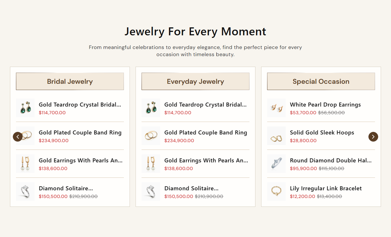
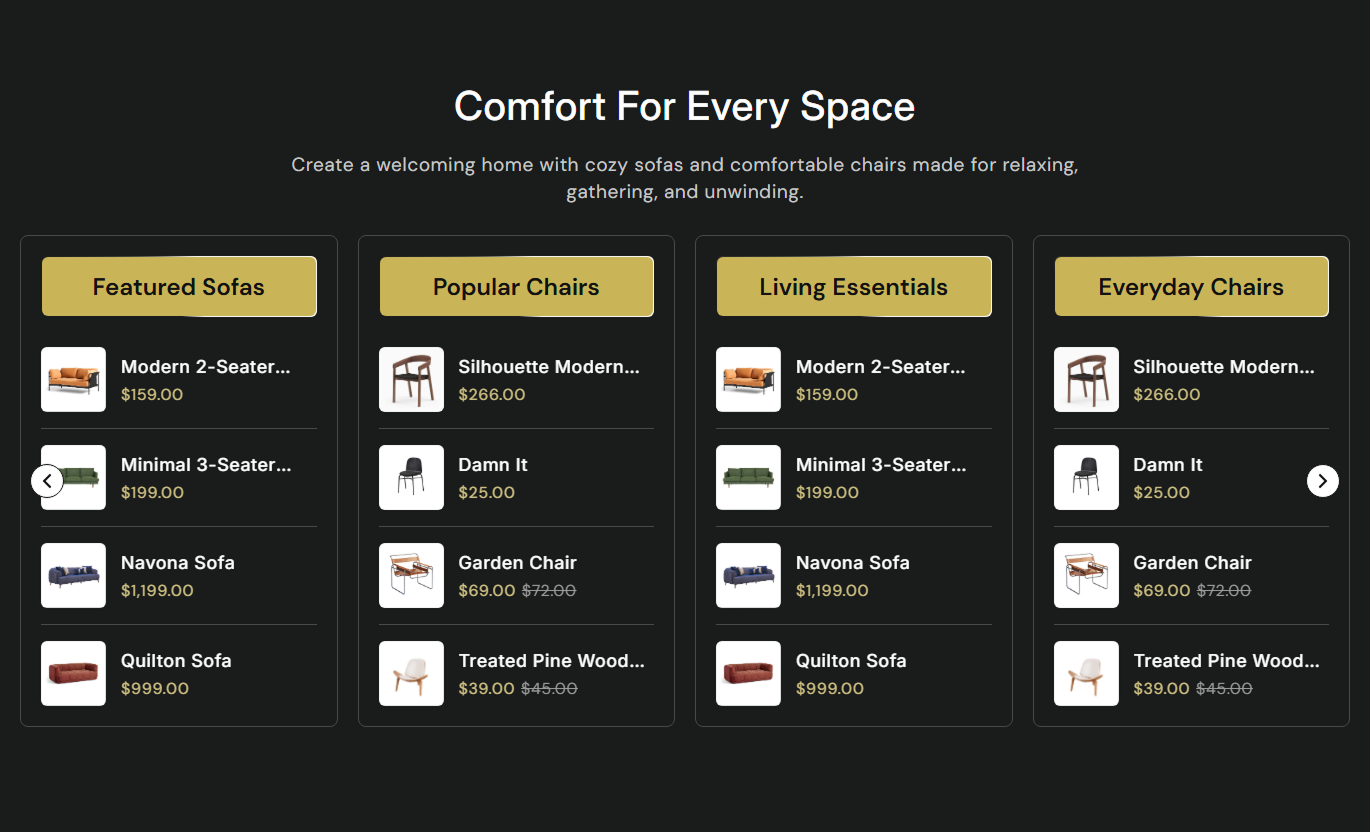


Showcase multiple product collections in an interactive slider with customizable layouts, product images, pricing, and responsive controls to create an engaging shopping experience.

Display multiple product collections in a slider, allowing customers to explore different collections in an organized layout.

Select collections for each block, and automatically display their products without adding individual products manually.

Choose the product image position and adjust the number of collection columns displayed on the desktop.

Show a product's second image when customers hover over it, provided the product has multiple images.

Enable autoplay and continuous looping to keep the main collection slider moving through the available collection blocks.

Set the number of products displayed in each collection slider, with a configurable limit from 4 to 20 products.

Display product titles and prices, including compare-at prices when they are higher than the current product prices.

Provide desktop navigation arrows and mobile pagination dots to help customers navigate the collection slider on both desktop and mobile.
Customize the section layout, product display, slider behavior, typography, and overall appearance to match your store design.

Applies to the whole section
Add a main heading and description to introduce your product collections.
Heading & ContentChoose the alignment of the section text.
Text AlignmentSet the position of product images and collection content.
Media PositionEnable or disable the second product image on hover.
Show Second Image on HoverControl slider autoplay and infinite looping.
Enable Autoplay & Enable LoopSet the autoplay speed for the main slider.
Autoplay SpeedChoose how many collection columns appear on the desktop.
Desktop ColumnsEnable or disable navigation arrows on desktop.
Show Desktop Navigation ArrowsAdjust heading, content, collection heading, and product text sizes.
Typography SettingsCustomize section and collection backgrounds, text, borders, and product divider colors.
Color SettingsAdjust section spacing for desktop and mobile devices.
Desktop & Mobile PaddingChoose a full-width layout or set a maximum section width.
Full Width & Section Max Width
Applies to each collection block
Add a heading for the collection block.
HeadingSelect the collection whose products you want to display.
CollectionChoose how many products to show in the collection slider.
Products LimitUse multiple collection columns and product sliders to organize product categories, highlight featured items, and help visitors discover products across your Shopify store.
Display different product collections in separate columns to introduce your store's product ranges and guide visitors toward popular categories.
Highlight multiple product collectionsShowcase featured productsOrganize products by categoryEncourage product discoveryShowcase related collections and their products in a structured slider to help customers explore more product categories.
Highlight related collectionsDisplay products from different categoriesSupport product discoveryEncourage further browsingDisplay products from selected collections alongside product content to introduce additional product options and related categories.
Highlight related product rangesShowcase additional productsIntroduce other collectionsSupport further product explorationUse collection columns to present selected product ranges for campaigns, promotions, or specific shopping categories.
Highlight selected product categoriesShowcase multiple product rangesPresent product details clearlyGuide visitors to product pagesShowcase multiple product collections in one interactive slider, helping customers explore products while giving Shopify merchants more control over product presentation.
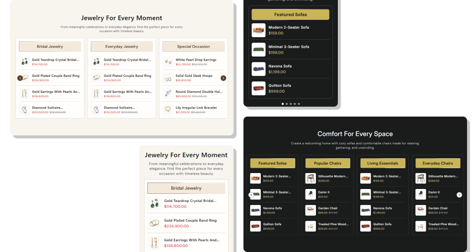 Showcase multiple product collectionsDisplay products automatically from collectionsHighlight products with second-image hoverCustomize desktop collection columnsControl autoplay and slider loopingAdjust the number of products per collectionDisplay product prices and compare-at pricesCustomize the layout to match your brand
 Select relevant collections to make product browsing easier.
Use clear collection headings to help shoppers identify products.
Enable second-image hover to show additional product views.
Set suitable product limits to keep collection sliders organized.
Customize colors and spacing to match your store design.
 Add unrelated collections that may confuse your customers.
Use too many products if browsing feels overwhelming.
Enable autoplay without considering the browsing experience.
Choose low-quality product images for your collection blocks.
Ignore mobile spacing and slider navigation settings.
Yes. You can add multiple collection blocks and select a different Shopify collection for each block to showcase their products.
Yes. Use the Products Limit setting to choose how many products to display in each collection (4 to 20).
Yes. Enable Show Second Image on Hover to display the second product image when customers hover over a product with multiple images.
Yes. You can enable autoplay, adjust its speed from 1 to 9 seconds, and enable looping for continuous slider navigation.
Yes. The Desktop Columns setting lets you choose between 2 and 5 columns for displaying collection blocks on desktop screens.
Yes. When a product's compare-at price is higher than its current price, the section displays both prices.
Yes. You can customize typography, backgrounds, text colors, borders, product styling, navigation arrows, and section spacing.
Yes. The section adapts its collection slider layout for smaller screens and displays mobile pagination dots for navigation.
For Support or any Questions Email Us: [email protected]
Install SectionHub and add the Product List Categories to your theme in minutes - no coding required.