Introduce Your Services with Interactive Visuals
Use a rotating service wheel on your homepage to introduce your main offerings. Visitors can explore each service, read its benefits, and follow useful links.

Present your services in an interactive rotating wheel with images, descriptions, feature lists, and buttons. Help Shopify visitors explore your offerings on desktop and mobile.
 2.0 Compatible
Interactive Service Wheel
Mobile Accordion Layout
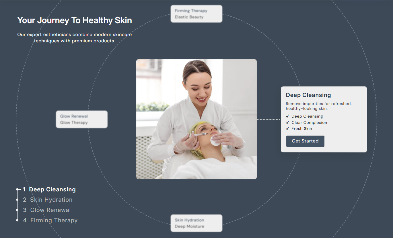
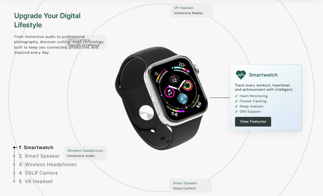


Display your services through a rotating wheel, clickable navigation, detailed content cards, and mobile accordions with flexible styling and content options.

Display service items around a circular wheel that rotates smoothly when visitors select different service tabs on the desktop.

Let visitors switch between services using numbered navigation tabs that update the selected image and content card.

Give each service its own image, heading, description, feature list, and optional button to explain what you offer.

Add a main image and supporting icon to each service block to make your offerings easier to recognize and understand.

Show services in expandable accordion panels on mobile, keeping descriptions, images, and buttons organized.

Add a list of key details or benefits inside each service card to help visitors understand what makes each offering useful.

Add a unique button label and destination link for each service, guiding visitors to the relevant pages or information.

Customize section colors, card backgrounds, gradients, text sizes, button styles, and spacing to suit your storefront.
Customize service content, navigation rotation, images, colors, buttons, and mobile layouts in your Shopify theme editor.

Applies to the whole section
Add the main heading displayed above your services.
Section Heading TextAdd supporting text to introduce your service offerings.
Section Description TextChoose separate heading alignment for desktop and mobile.
Content Text AlignmentAdjust heading, description, tab, and card text sizes.
Typography Size ControlsChoose a filled or outlined style for service buttons.
Button Outline StyleAdjust the button's font size and rounded corners.
Button Size and CornersSet the section background and service text colors.
Section Color SettingsChoose solid or gradient backgrounds for service cards.
Service Card BackgroundCustomize active and inactive service navigation colors.
Service Tab Text ColorsAdjust top and bottom spacing on smaller screens.
Mobile Section Padding
Applies to each service item
Upload the main image for the selected service.
Service ImageAdd a small icon to visually identify the service.
Service IconAdd supporting text for the service wheel card.
Service SubheadingEnter the main title displayed for this service.
Service HeadingWrite a short description of the service offered.
Service ContentList important features or benefits of the service.
Service ListSet the button text and its destination separately.
Button Label & LinkAdd an interactive service showcase to important Shopify pages to explain your offerings, highlight key details, and help visitors find relevant information.
Use a rotating service wheel on your homepage to introduce your main offerings. Visitors can explore each service, read its benefits, and follow useful links.
Introduce your main services in one interactive sectionHelp new visitors understand what your business offersUse service images to make each option more recognizableHighlight important service details without long pagesGuide visitors toward relevant service or contact pagesPlace a service showcase on collection pages to explain related offerings, such as installation, customization, or care. Give visitors more context as they browse.
Introduce services that complement the collectionExplain available customization or installation optionsHighlight support services related to product categoriesConnect shoppers with useful service information pagesKeep supporting service details organized in one areaUse service cards on product pages to highlight useful options such as fitting, maintenance, or setup assistance. Help shoppers understand available support.
Explain services connected to the selected productShow useful care, setup, or maintenance informationHighlight optional assistance available to customersProvide direct links to relevant service detail pagesKeep product support information easy to exploreBuild a dedicated landing page that introduces several services through images, descriptions, and feature lists. Let visitors compare offerings and open related pages.
Present several services without using separate sectionsGive each service its own image and supporting detailsHelp visitors compare available service options visuallyUse clear action buttons to direct interested visitorsMake service information accessible on smaller screensPresent multiple services in one interactive layout. Combine images, feature lists, and direct links to help visitors understand what your business provides.
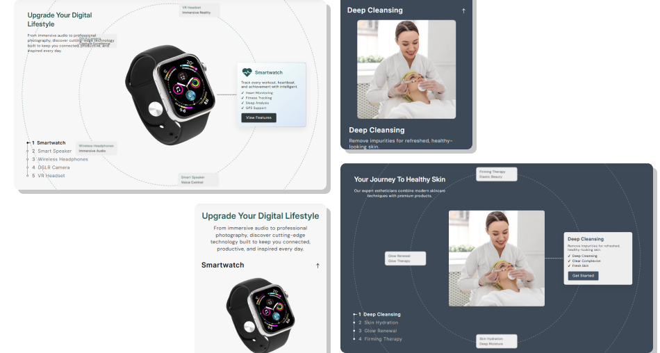
Use a rotating wheel and detailed service cards to organize your offerings, while mobile accordions keep the same content easy to browse.
Showcase up to six services within one organized sectionMake service selection interactive with rotating navigationExplain each offering through images and descriptionsHighlight important service features in clear listsAdd individual buttons for relevant service destinationsCustomize card colors, gradients, text, and button stylingDisplay service information in mobile-friendly accordions Use clear service titles that explain each offering.
Choose relevant, high-quality images for every service.
Keep service descriptions short and easy to understand.
Highlight important service benefits in simple lists.
Link each service button to a relevant destination page.
 Add unrelated services just to fill all available slots.
Use blurry or mismatched images across service cards.
Write long descriptions that overcrowd the service cards.
Add vague button labels that hide where the link leads.
Use background colors that make service text hard to read.
You can add up to six service blocks. Each block supports its own image, icon, heading, subheading, description, service list, and button.
Visitors can click a numbered service tab to select an offering. The wheel rotates to the chosen item and displays its corresponding service image and content.
Yes. Every service block includes separate Image and Icon settings, allowing you to add a main visual and a supporting icon for that service.
Yes. Each service block has Button Label and Link settings. Add your preferred button text and select the page or destination you want visitors to open.
Visitors can click a numbered service tab to select an offering. The wheel rotates to the selected item, displaying its corresponding service image and content.
Yes. Choose a solid or gradient card background, adjust text and tab colors, and customize button colors, outline style, corner radius, and hover appearance.
Yes. Each service block has its own Content and Service List fields. You can write a separate description and add relevant feature points for every offering.
The section uses Shopify's standard section schema and blocks. It is designed for compatible Online Store 2.0 themes, though appearance and behavior should be tested in your theme.
For Support or any Questions Email Us: [email protected]
Install SectionHub and add the Our Services Showcase section to your theme in minutes - no coding required.