Introduce Your Brand's Most Important Features
Use interactive feature rows on your homepage to explain what makes your business different. Combine short descriptions, supporting visuals, and helpful links.

Showcase your products, services, or brand highlights with interactive feature rows, expandable image and video galleries, custom descriptions, and links on any Shopify store page.
 2.0 Compatible
Interactive Feature Rows
Image & Video Support
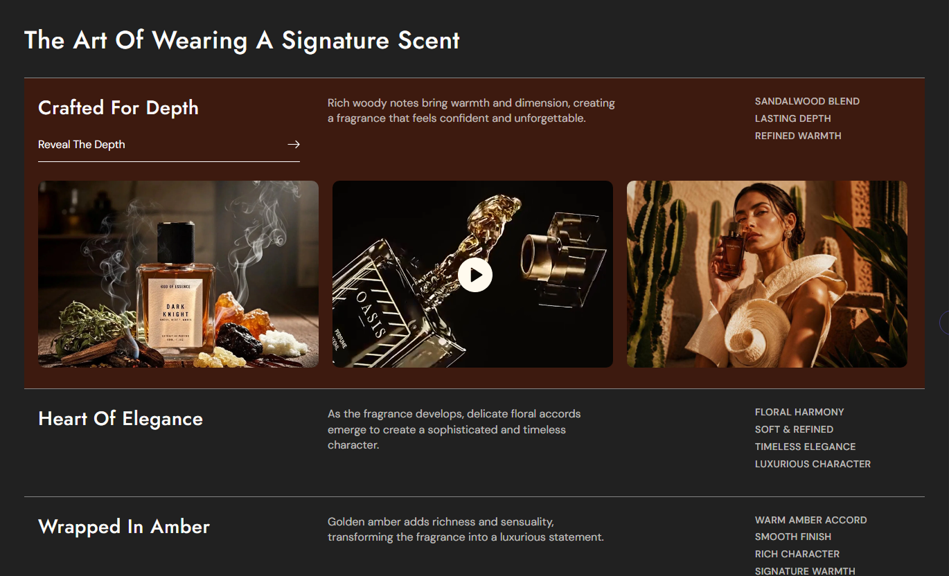
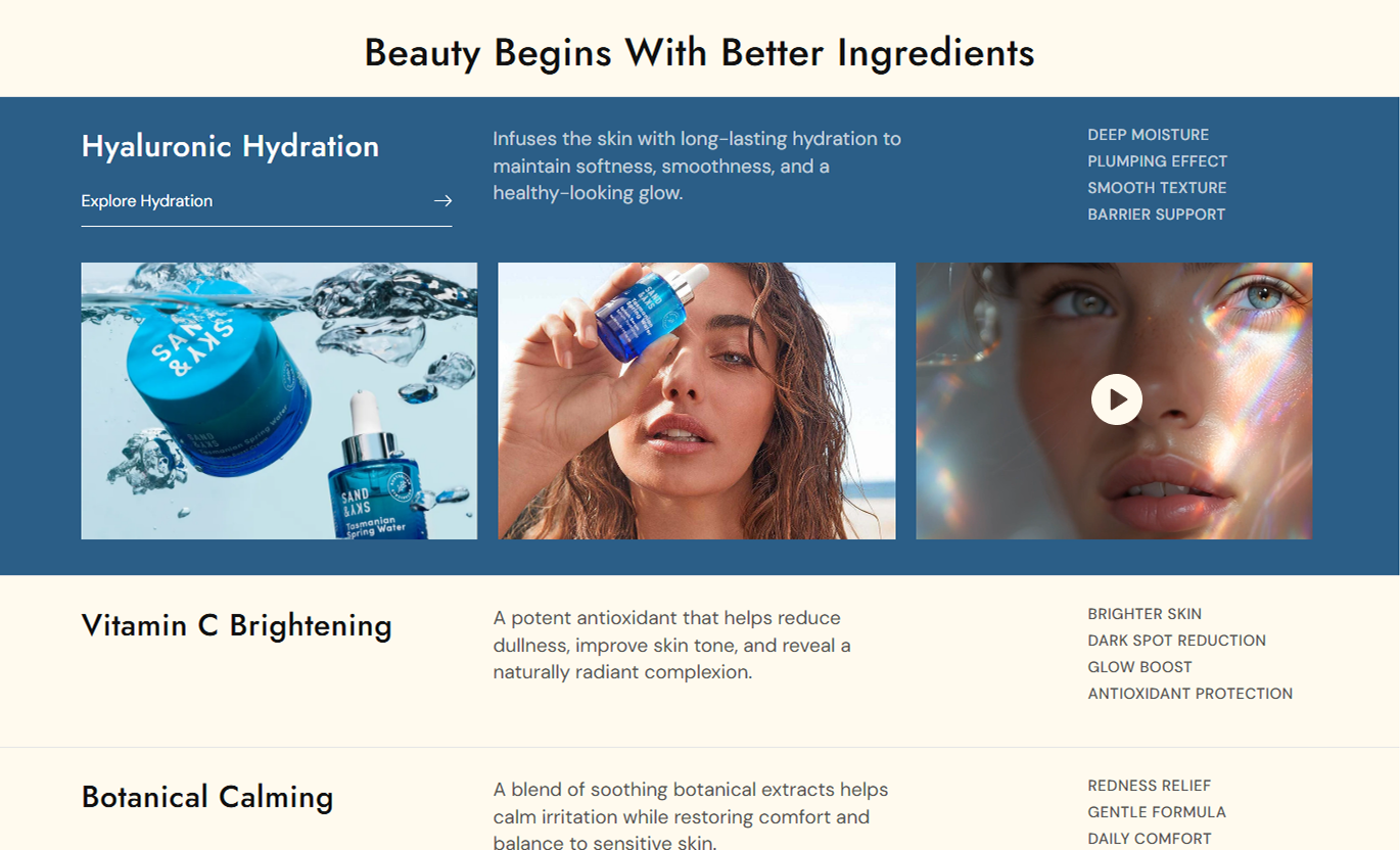


Present your store's key features through expandable content rows, images, videos, custom backgrounds, and animated links in a flexible Shopify section layout.

Reveal additional images or videos when visitors hover over a feature row on desktop, keeping the main layout clean and organized.

Add up to three media items to each feature row, choosing between Shopify-hosted videos and images for every available slot.

Give each feature its own heading and supporting description to explain product details, services, or important brand information.

Add comma-separated feature points that appear as a clear list, helping visitors scan important details without reading long paragraphs.

Add a custom text link to each feature row with an animated arrow and underline effect that responds when visitors hover over it.

Choose a separate background color for every feature row to highlight different topics and create visual contrast during interaction.

Display feature content in stacked mobile rows with horizontally scrollable image and video galleries that work on smaller screens.

Adjust heading sizes, text colors, media proportions, rounded corners, spacing, and section width to match your storefront design.
Control feature rows, media layouts, typography, colors, spacing, and interactive content through your Shopify theme editor.

Applies to the whole section
Add a main heading above the interactive feature rows.
Section Heading TextWrite supporting text to introduce the feature list.
Section Description TextChoose the alignment of the main section heading and text.
Content Text AlignmentSelect small, medium, or large media proportions.
Feature Media SizeAdjust image and video corner rounding for all rows.
Media Border RadiusSet the heading, description, and feature text sizes.
Feature Typography SizeCustomize section colors, feature text, and hover colors.
Section Color SettingsChoose border colors separating the feature rows.
Feature Border ColorAdjust feature row padding for desktop and mobile.
Feature Card PaddingSet a full-width display or a custom maximum width.
Section Width Settings
Applies to each feature item
Enter the main title displayed for this feature row.
Feature HeadingAdd a description explaining the feature or offering.
Feature ContentEnter comma-separated points to create a feature list.
Feature PointsSet the action text and destination for the feature.
Button Label & LinkChoose an image or video and upload media for a slot.
Media SettingsUse expandable feature rows on important Shopify pages to explain product benefits, introduce services, share brand details, and showcase supporting images or videos.
Use interactive feature rows on your homepage to explain what makes your business different. Combine short descriptions, supporting visuals, and helpful links.
Introduce your brand's main strengths in one sectionHighlight important services and product advantagesUse images and videos to support your brand messageKeep detailed feature visuals hidden until hoveredDirect visitors toward useful store information pagesAdd feature rows to collection pages to explain product materials, design choices, or category benefits. Support each topic with relevant images and videos.
Explain important qualities shared by collection itemsShowcase material details through close-up photographsDemonstrate category features with supporting videosHighlight useful information before shoppers browse itemsLink visitors to relevant collection or information pagesUse expandable feature rows to present product details, materials, construction methods, and care information. Add visuals that help explain each feature.
Break detailed product information into clear sectionsShow different product features with supporting imagesDemonstrate product functions through short video clipsPresent specifications in easy-to-scan feature listsConnect shoppers with product guides or support pagesBuild campaign landing pages with feature rows that highlight selected products, services, or benefits. Reveal additional visuals as visitors explore each topic.
Organize campaign highlights into separate feature rowsCombine campaign photography with short product videosHighlight unique selling points through structured listsUse individual row colors to separate campaign topicsGuide interested visitors to relevant campaign pagesOrganize your important store information into interactive feature rows. Use descriptions, visual galleries, and links to give shoppers useful details.
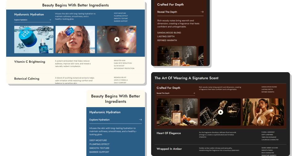
Keep feature details organized in separate rows while allowing visitors to easily explore supporting images, videos, and useful links.
Present multiple product or service features in one sectionReveal additional images and videos through desktop hoverExplain important details with descriptions and point listsAdd up to three image or video items to each feature rowGuide visitors to useful pages through animated text linksCustomize individual backgrounds and overall section colorsKeep media galleries accessible on smaller mobile screens Use short feature titles that explain the main benefit.
Choose high-quality images that support each feature.
Keep descriptions focused on useful product or service details.
Use comma-separated points for quick, readable feature lists.
Test media display and horizontal scrolling on mobile screens.
 Add unrelated images or videos just to fill every media slot.
Write long descriptions that overcrowd the feature rows.
Use unclear button labels that hide the destination page.
Choose background colors that reduce text readability.
Upload oversized video files without checking page performance.
Open the Shopify theme editor, add the Interactive Feature Showcase section, and create Feature Item blocks. Each block includes a heading, description, feature points, media, and link settings.
Yes. Each feature row supports three media slots. You can choose an image or a Shopify-hosted video independently for each slot, allowing mixed visual content.
When visitors hover over a feature row, its background changes and the media area expands to reveal available images or videos. It collapses when the pointer leaves.
Yes. Every feature block includes a rich-text description and a Feature Points field. Enter points separated by commas to display them as individual list items.
Yes. Each block has its own Button Label and Link settings. The section displays an animated text link that can lead visitors to your selected destination.
On mobile, feature details remain visible in stacked rows. The media gallery becomes horizontally scrollable, allowing visitors to swipe through images and videos.
Yes. Set individual row backgrounds and adjust feature text, hover colors, media proportions, rounded corners, and padding through the theme editor.
The section uses Shopify's standard sections and blocks structure. It is intended for compatible Online Store 2.0 themes, but you should test the interactive layout in your theme.
For Support or any Questions Email Us: [email protected]
Install SectionHub and add the Interactive Feature Showcase section to your theme in minutes - no coding required.