Create a More Interactive Homepage
Feature bestsellers, collections, categories, or campaigns with a hover effect that gives visitors another look at your content.

Show a second image on hover to give shoppers a closer look at products, collections, and campaigns. Add links and create a flexible visual grid without coding.
 OS 2.0 Ready
Interactive Hover Effect
No Coding Needed
OS 2.0 Ready
Interactive Hover Effect
No Coding Needed 

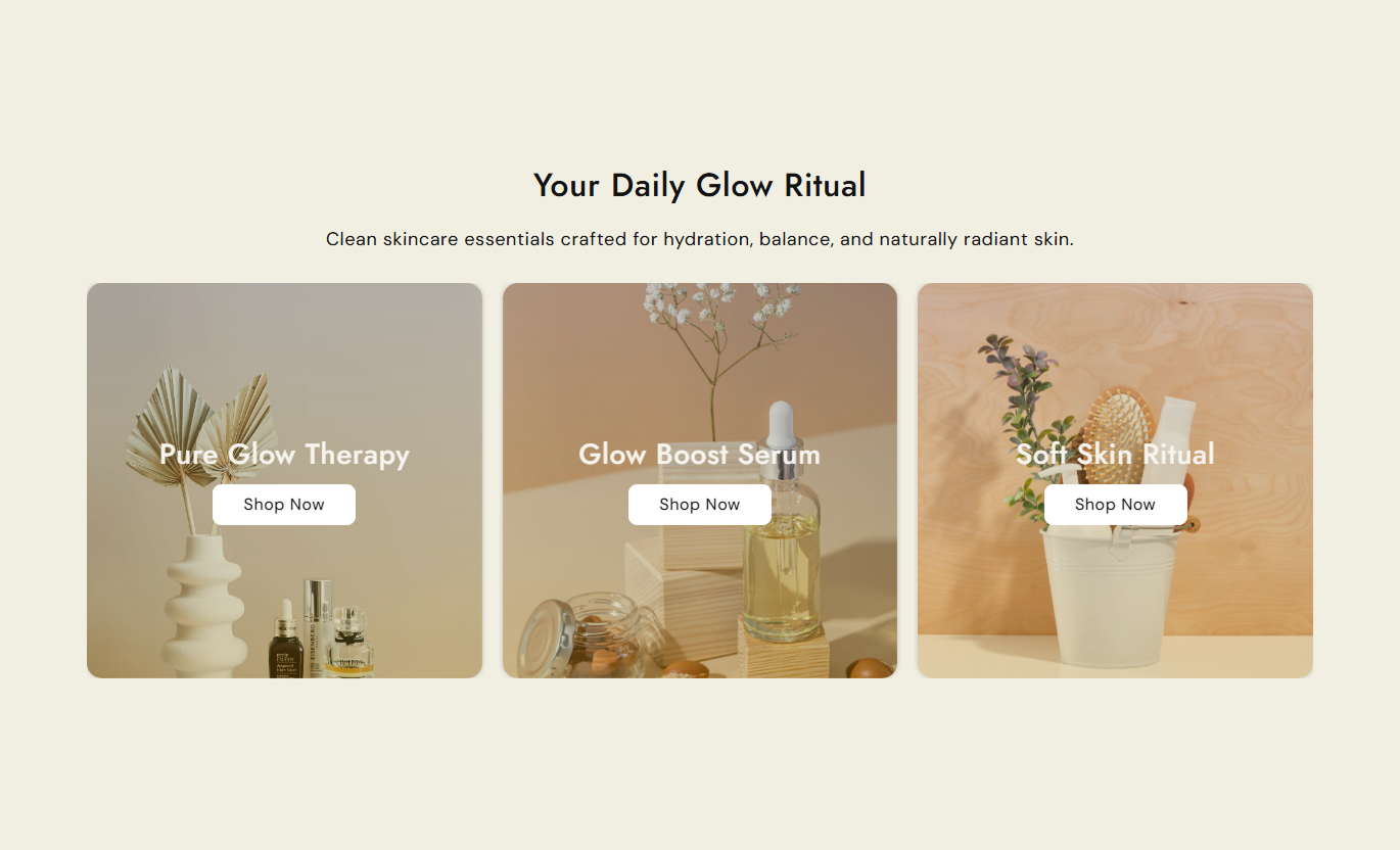


Create a flexible image grid with hover swaps, multiple layouts, responsive columns, optional buttons, and slider controls.

Show a second image when visitors hover over an item.

Choose between a standard or asymmetric grid layout.

Add autoplay, loop, arrows, and dots to your slider.

Set separate column counts for desktop and mobile.

Choose from nine positions for headings and buttons.

Add a solid or outline button with your own label and link.

Choose Small, Medium, or Large image heights.

Adjust colors, spacing, fonts, and layout without code.
Control the layout, images, content, buttons, and styling directly from the theme editor.

Applies to the whole section
Main title displayed above the grid.
Section HeadingSupporting text displayed below the main title.
Section ContentChoose how the section content is aligned.
Content AlignmentSet the height of the grid images.
Image HeightChoose where content appears on the image.
Content PositionTurn slider mode on or off.
Enable SliderChoose the grid structure for your items.
Grid LayoutAutomatically move slides at set intervals.
AutoplayChoose the number of columns for the desktop.
Number of Columns on DesktopChoose the number of columns for mobile.
Number of Columns on MobileShow or hide the item buttons.
Enable ButtonSet the section background color.
Background ColorSet the main heading color.
Main Title ColorSet the section content color.
Content ColorSet the image overlay color.
Overlay ColorCustomize button background, text, and border colors.
Btn Bg / Text / Border ColorMake the section span the full available width.
Full WidthSet the maximum width of the section.
Section Max Width
Applies to each grid item
Main image displayed for the grid item.
Background ImageImage shown when visitors hover over the item.
Swap ImageTitle displayed on the grid item.
HeadingText displayed on the item button.
Button LabelThe link opens when the button is clicked.
Button LinkUse the Image Swap Grid across your store to visually feature products, collections, campaigns, or related content.
Feature bestsellers, collections, categories, or campaigns with a hover effect that gives visitors another look at your content.
 Highlight featured productsShowcase collectionsAdd visual varietyEncourage exploration
Show sub-categories or featured products with a second image on hover, giving shoppers more visual information while they browse.
Highlight sub-categoriesImprove product discoveryAdd visual varietySupport easier browsingFeature related products, accessories, styling ideas, or product features with a compact grid that gives shoppers more to explore.
Showcase related productsAdd useful visual contentSupport cross-sellingImprove product discoveryUse the grid for launches, promotions, or seasonal campaigns. Add buttons to guide visitors directly to the right page.
Highlight campaign contentAdd interactive visualsSupport clear CTAsGuide visitors to key pagesShow more product information without adding clutter. Use hover images, flexible layouts, responsive columns, and optional buttons to build a grid that fits your store.

Build a responsive image grid that gives you control over layout, content placement, images, and styling.
Show a second product viewHighlight multiple collectionsAdd clear CTAsKeep layouts responsiveCreate a more visual storefrontMatch the section to your brand Use high-quality images
Keep image crops consistent
Use short headings
Add buttons when useful
Keep grid items balanced
Use high-quality images
Keep image crops consistent
Use short headings
Add buttons when useful
Keep grid items balanced  Use unrelated images
Mix different image sizes
Add too much text
Use too many mobile columns
Use blurry images
Use unrelated images
Mix different image sizes
Add too much text
Use too many mobile columns
Use blurry images Yes. Add a default image and a swap image. The second image appears when visitors hover over the item.
Yes. Enable slider mode and use autoplay, loop, arrows, or dot navigation.
Yes. Choose between a standard column grid (Layout 1) or an asymmetric grid (Layout 2).
Yes. Add a custom button label and link, with a solid or outline button style.
Yes. Set desktop columns from 1–5 and mobile columns from 1–2.
Yes. Choose from nine positions for the heading and button within each grid item.
Yes. Customize the background, heading, content, overlay, button, and arrow colors in the theme editor.
For Support or any Questions Email Us: [email protected]
Install SectionHub and add the Image Swap Grid section to your theme in minutes- no coding required.