Create a Dynamic Visual Introduction to Your Brand
Place an Image Marquee on your homepage to introduce your brand through moving photography. Combine product and lifestyle images to create a memorable visual display.

Display your brand imagery in a continuous animated marquee with customizable image sizes, rounded corners, animation speed, and top- or bottom-display options.
 2.0 Compatible
Responsive Design
Continuous Image Animation
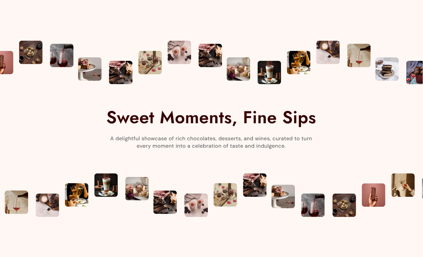
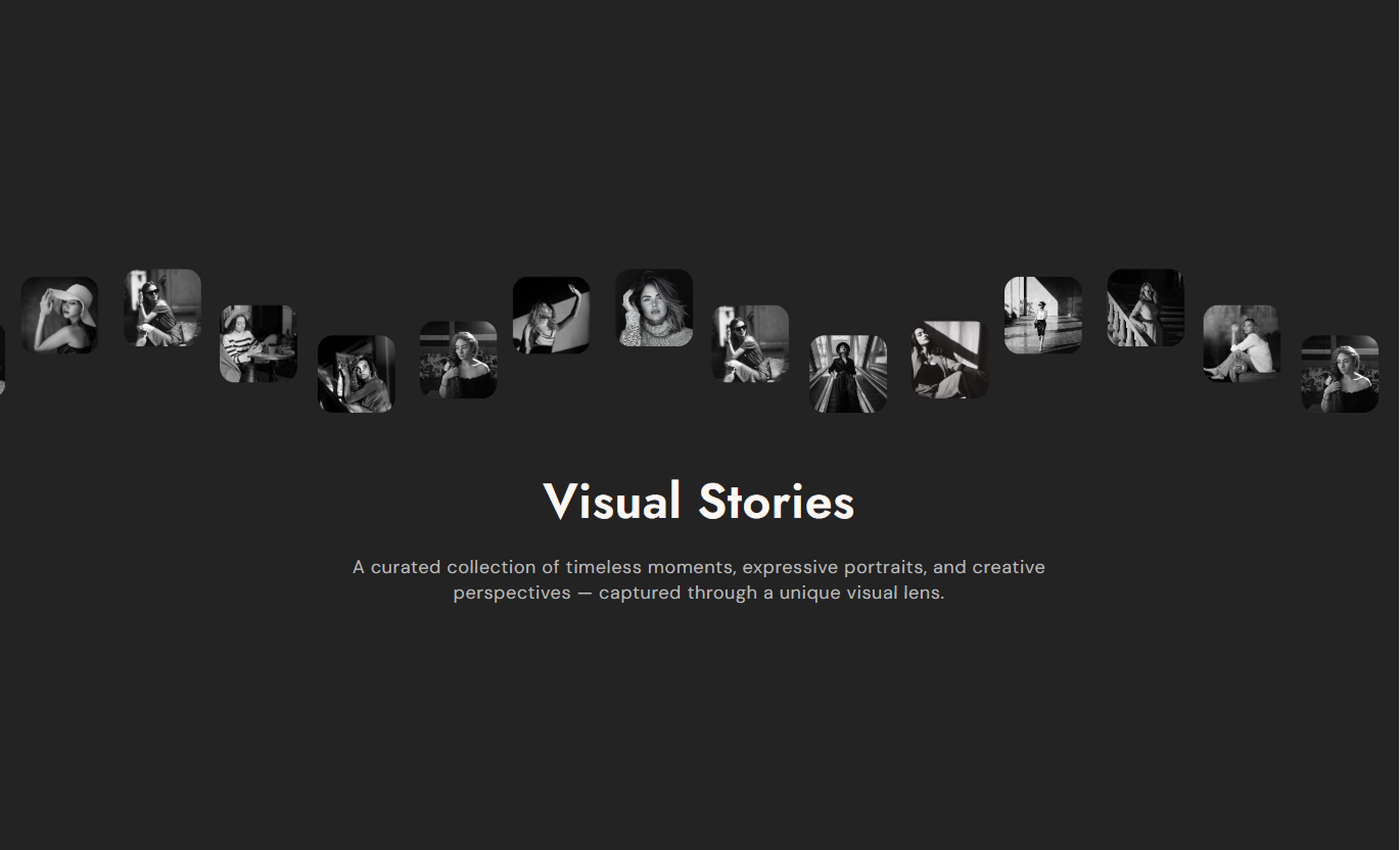
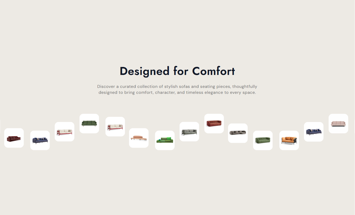


Create a dynamic visual presentation with continuously moving images, flexible display positions, adjustable animation speed, and responsive styling for your Shopify store.

Display images moving continuously along a curved path to create an animated visual marquee for your storefront.

Show the animated image marquee above the content, below it, or on both sides, depending on the display setting.

Add up to two image groups, each with 10 image slots, to build a larger visual presentation.

Choose small, medium, or large image sizing to control how images appear within the animated marquee.

Set the animation duration to 10-60 seconds to control how quickly images travel along the path.

Adjust the image border radius from 0 to 20 pixels to create square or rounded image presentations.

Add a heading and rich-text description, then customize their font sizes and text colors.

Customize desktop and mobile section spacing while the marquee adjusts its SVG width for smaller screens.
Customize the marquee content, image presentation, animation behavior, colors, section width, and spacing to match your Shopify store design.
Applies to the whole section
Add a main heading and rich-text description to introduce the animated image marquee.
Heading & ContentChoose whether the animated images appear above the content, below it, or in both positions.
Marquee DisplaySelect small, medium, or large image sizing for the marquee presentation.
Image SizeControl how quickly images move along the animated path by adjusting the duration.
Animation SpeedAdjust the corner rounding of the marquee images.
Border RadiusCustomize the heading and content font sizes to your section design.
Font Size SettingsSet the section background, heading, and content colors.
Color SettingsAdjust the top and bottom spacing separately for desktop and mobile screens.
Desktop & Mobile PaddingChoose a full-width display or set a custom maximum section width.
Section Width
Applies to each Image Group block
Upload up to 10 images per image group to populate the animated marquee.
Image 1-10Use Image Marquee across key Shopify pages to create moving visual displays, highlight brand imagery, showcase product photography, and add an engaging design element.
Place an Image Marquee on your homepage to introduce your brand through moving photography. Combine product and lifestyle images to create a memorable visual display.
Make the homepage more engaging with moving brand imageryShowcase product photography in a continuous visual displayIntroduce brand aesthetics through lifestyle imagesPosition the marquee above or below the main contentCreate a distinctive visual element near the homepage sectionsUse Image Marquee on collection pages to display product and category imagery in motion. It can introduce a collection theme or add visual context around product listings.
Highlight the visual theme of a product collectionDisplay related product images in a moving sequenceAdd a visual break around collection product listingsUse image sizing to suit the available page spaceMatch the marquee background with collection page stylingAdd Image Marquee to product pages to display product and lifestyle photography in motion. Use the image sequence to provide additional visual context alongside product information.
Present product and lifestyle imagery in one marqueeAdd supporting visuals around product informationMaintain a consistent image presentation across the pageAdjust image corners to complement product photographyControl marquee placement around other product contentUse Image Marquee on landing pages to create a moving display of campaign, product, or brand images. Adjust its speed and position to complement the page's visual flow.
Create a moving image display for campaign visualsCombine promotional and brand photography in one sectionChoose top, bottom, or dual marquee placementSet animation duration to suit the campaign designUse custom section width to fit the landing page layoutCreate a continuous animated image display that adds movement to your Shopify storefront while giving you control over image sizing, animation speed, placement, and styling.
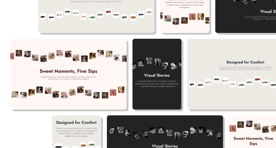 Display images in a continuous animated marqueeAdd up to twenty image slots across two groupsChoose between three image size optionsDisplay the marquee at the top, bottom, or bothAdjust animation duration from 10 to 60 secondsCustomize image corner roundingStyle heading, content, and section background colorsSet separate desktop and mobile section spacing
 Add twenty suitable images for the intended marquee display.
Use clear, high-quality images with a consistent visual style.
Choose an image size that suits your page layout.
Set animation speed to keep the movement comfortable to view.
Preview desktop and mobile spacing before publishing.
 Mix unrelated images that make the marquee feel inconsistent.
Use low-resolution images that appear unclear when displayed.
Set an animation speed that distracts from page content.
Ignore the section's top and bottom spacing on mobile.
Leave image slots empty to avoid placeholders.
You can add up to two Image Group blocks, each with 10 image slots. The section guidance recommends adding exactly twenty images for the best visual appearance.
Yes. The Marquee Display setting lets you show the animated images at the top, at the bottom, or in both positions around the section content.
Yes. You can adjust Animation Speed from 10 to 60 seconds. This setting controls the duration of the images' movement along the marquee path.
The section provides three image size options: Small, Medium, and Large. Choose the option that best fits your preferred visual presentation.
Yes. Use the Border Radius setting to adjust image corner rounding from 0 to 20 pixels, allowing you to create sharper or more rounded corners.
Yes. You can add a heading and rich-text content above or between the marquee rows. Their font sizes and text colors are customizable.
Yes. The section includes separate mobile top and bottom padding settings, along with responsive CSS that adjusts the marquee width and text sizing on smaller screens.
An empty image slot displays a placeholder image instead. Uploading suitable images to the available slots helps create the intended visual marquee.
For Support or any Questions Email Us: [email protected]
Install SectionHub and add the Image Marquee section to your theme in minutes - no coding required.