Turn Homepage Images Into Interactive Stories
Use a large lifestyle or brand image with hotspots to introduce products, highlight collections, or point shoppers toward important store content.

Add an image with clickable hotspots to highlight products, collections, or key details. Share useful content without taking shoppers away from the visual.
 Interactive Hotspots
Desktop & Mobile
Flexible Image Layout
Interactive Hotspots
Desktop & Mobile
Flexible Image Layout 


Turn a large image into an interactive shopping area with positioned hotspots, helpful text, responsive controls, and flexible section styling.

Add a large desktop image to create the main visual area where your interactive hotspots are displayed.

Use a separate mobile image to create a better layout for smaller screens and different device proportions.

Add multiple hotspot markers to an image and reveal additional titles and content when shoppers interact with them.

Set horizontal and vertical positions for every hotspot so markers appear exactly where you need them.

Set separate hotspot positions for mobile devices to keep markers aligned with your mobile image.

Choose an image height that adapts to the image or use small, medium, or large preset layouts.

Position the main heading, content, and button in different areas of the image on desktop layouts.

Hotspot details adjust for smaller screens with a mobile-friendly popup experience and responsive section layout.
Control images, content, hotspot placement, colors, spacing, buttons, and section width from the Shopify theme editor.

Applies to the whole section
Add the main heading shown with your image section.
Section HeadingAdd supporting text to explain the image or featured content.
Section ContentChoose the main image displayed on desktop screens.
Desktop ImageChoose a separate image for smaller mobile screens.
Mobile ImageChoose an adaptive, small, medium, or large image height.
Image HeightPlace the main content at different positions over the desktop image.
Desktop Text PositionSet how the heading and content are aligned within the section.
Text AlignmentAdd a button label and link for an optional section call to action.
Button Label & LinkChoose full width or set a custom maximum width for the section.
Section WidthCustomize backgrounds, text, content boxes, and button colors.
Section Colors
Applies to each hotspot
Add a short title for the information shown by the hotspot.
Hotspot HeadingAdd supporting information that appears when the hotspot is opened.
Hotspot ContentSet the hotspot's horizontal and vertical position on the desktop.
Desktop PositionSet separate horizontal and vertical positioning for mobile screens.
Mobile PositionCustomize hotspot icon, popup, and active state colors.
Hotspot ColorsUse image hotspots to add useful details to key store pages. Highlight products, features, collections, or visual information without cluttering the layout.
Use a large lifestyle or brand image with hotspots to introduce products, highlight collections, or point shoppers toward important store content.
 Highlight products inside lifestyle imageryAdd useful details without extra page sectionsGuide shoppers toward featured store contentCreate a more engaging homepage visualSupport brand storytelling with interactive images
Add an interactive image above or around collection content to highlight product groups, category details, or visual merchandising ideas.
Introduce a collection with strong visualsHighlight key product groups within one imageExplain category details with hotspotsAdd context before shoppers browse productsCreate a more visual collection experienceUse hotspots on product or lifestyle imagery to explain features, materials, design details, or related information without adding another long content block.
Point out important product featuresExplain details directly on the imageAdd context to product photographyKeep supporting information easy to accessMake product visuals more informativeCreate an interactive campaign image with hotspots that explain products, services, features, or promotional content while keeping the page visually focused.
Present campaign information visuallyHighlight multiple points in one imageKeep promotional content easy to exploreSupport focused landing page storytellingAdd interactive details without clutterGive shoppers more context directly within your images. Hotspots help organize supporting information while keeping the main visual clean and easy to explore.
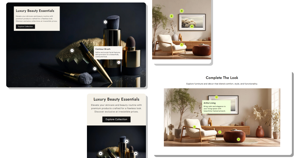
Keep important details close to the image while allowing shoppers to open only the information they want to explore.
Turn Images Into Interactive ContentKeep Visuals CleanHighlight Specific Image AreasCreate Separate Mobile LayoutsControl Content PlacementMatch Your Store DesignAdd Multiple Information Points Use a clear image where hotspot positions are easy to identify.
Place each hotspot close to the product or detail it explains.
Keep hotspot titles short and easy to understand.
Use a separate mobile image when the desktop image does not fit well.
Keep supporting hotspot content useful and directly related to the image.
Use a clear image where hotspot positions are easy to identify.
Place each hotspot close to the product or detail it explains.
Keep hotspot titles short and easy to understand.
Use a separate mobile image when the desktop image does not fit well.
Keep supporting hotspot content useful and directly related to the image.  Place too many hotspots where markers become difficult to distinguish.
Position hotspots over areas that make the underlying detail hard to see.
Use long titles that make hotspot popups harder to scan.
Ignore mobile positioning when your image changes on smaller screens.
Add unrelated information that does not support the main image.
Place too many hotspots where markers become difficult to distinguish.
Position hotspots over areas that make the underlying detail hard to see.
Use long titles that make hotspot popups harder to scan.
Ignore mobile positioning when your image changes on smaller screens.
Add unrelated information that does not support the main image. Yes. You can add a desktop image and a separate mobile image from the Shopify theme editor to create a responsive visual layout.
Yes. The section supports a dedicated mobile image, allowing you to choose a better composition for smaller screens.
Each hotspot can contain a heading and content. Shoppers can select a hotspot marker to open its related information.
Yes. You can add multiple hotspot blocks, with each block having its own heading, content, and desktop and mobile positions.
Yes. Each hotspot has separate horizontal and vertical position settings for desktop and mobile layouts.
Yes. Choose an adaptive image height or select a small, medium, or large preset from the section settings.
Yes. You can add a button label and link, and choose whether the button uses the standard or outline style.
Yes. The section includes mobile-specific image, text alignment, hotspot positioning, and popup behavior for smaller screens.
Yes. You can customize hotspot icon colors, active icon colors, popup backgrounds, and related content colors.
For Support or any Questions Email Us: [email protected]
Install SectionHub and add the Hotspot with Text section to your theme in minutes- no coding required.