Highlight Your Featured Collections
Display your important collections on the homepage with attractive images and interactive titles to guide visitors toward different product categories.

Display your Shopify collections with an interactive image-and-title layout. Let visitors explore different collections by hovering over collection titles and clicking collection images to visit each collection's page.
 2.0 Compatible
Responsive Design
Interactive Collection Switching
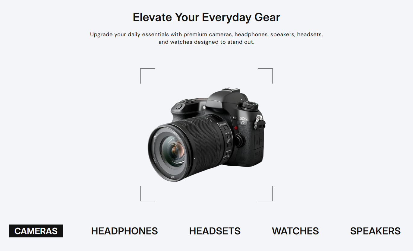
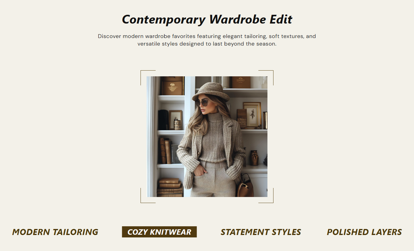


Create an engaging collection browsing experience with custom images, interactive titles, flexible styling, and responsive layouts.

Change the displayed collection image when visitors hover over a collection title.

Upload your own image for each collection or automatically use the selected collection's featured image.

Link each collection image directly to its respective Shopify collection page.

Add custom headings for each collection or use the collection's default title.

Add up to 5 collection blocks in one section.

Highlight the active collection title with customizable text and background colors.

Add styled corner borders around the collection image.

Adjust the section layout, image size, and spacing for desktop and mobile screens.
Control the collection content, typography, colors, image styling, and section layout from one place.

Applies to the whole section
Main heading displayed above the collection list.
HeadingSupporting text displayed below the main heading.
ContentChoose the alignment of the section text.
Content alignmentSet the font size of the main heading.
HeadingSet the font size of the section description.
ContentSet the font size of collection titles.
HeadingSet the background color of the section.
Background colorCustomize the main heading text color.
Heading colorSet the description text color.
Content colorChoose the color of the decorative image borders.
Image border colorSet the default text color of collection titles.
Heading colorCustomize the text color of the active collection title.
Active colorSet the background color of the active collection title.
Active background colorSet the top spacing of the section on the desktop.
Padding topSet the bottom spacing of the section on the desktop.
Padding bottomSet the top spacing of the section on mobile.
Padding topSet the bottom spacing of the section on mobile.
Padding bottomMake the section span the available width.
Full widthSet the maximum section width when full width is disabled.
Width (in px)
Applies to each collection
Upload an image to display for the collection.
ImageSelect the Shopify collection to display and link to.
Select collectionAdd a custom title for the collection or use its default title.
HeadingUse interactive collection images and titles to organize your store content, highlight important categories, and help visitors discover different product ranges.
Display your important collections on the homepage with attractive images and interactive titles to guide visitors toward different product categories.
Create a visually engaging homepageHighlight featured collectionsIntroduce different product categoriesHelp visitors discover productsPresent multiple collections in a single section, allowing visitors to explore them via rotating images and highlighted collection titles.
Showcase multiple collections togetherMake collection navigation more visualHighlight selected categoriesEncourage further browsingUse collection images and titles to highlight seasonal ranges, festival collections, holiday selections, or special product categories.
Highlight seasonal collectionsShowcase festival-related productsOrganize special product rangesDirect visitors to relevant collectionsFeature collections containing new arrivals and recently introduced product ranges to make them easier for visitors to discover.
Highlight new product categoriesShowcase recently added collectionsImprove collection visibilityGuide visitors to new rangesUse collection images and interactive titles to create a simple, engaging way for visitors to explore your Shopify collections and navigate directly to collection pages.
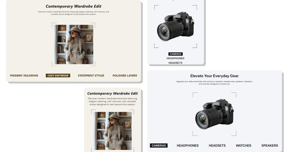 Showcase up to five collections in one sectionDisplay custom or collection featured imagesSwitch collection images on title hoverLink images directly to collection pagesCustomize typography and colorsAdd decorative image corner borders
 Use high-quality collection images
Keep collection images visually consistent
Use short and clear collection titles
Select relevant collections for your store
Choose contrasting colors for active titles
Maintain consistent image styling
Preview the section on desktop and mobile
 Use blurry or low-quality images
Add unrelated collections
Use overly long collection titles
Choose images that do not represent the collections
Use distracting color combinations
Overcrowd the section with unnecessary content
You can add up to 5 collection blocks in one section.
Yes. Each collection block includes an Image setting. If you don't upload a custom image, the selected collection's featured image is used.
Yes. When you select a collection, its image links directly to that collection page.
Yes. You can add a custom heading for each collection or use the selected collection's default title.
When visitors hover over a collection title, the corresponding collection image is displayed and the active title is highlighted.
Yes. You can customize the active title's text and background colors in the section settings.
Yes. Use the Image border color setting to change the color of the decorative corner borders.
Yes. The section adjusts its image dimensions, collection title layout, typography, and spacing for smaller screens.
Yes. Enable Full width to use the available screen width or set a custom maximum width when full width is disabled.
For Support or any Questions Email Us: [email protected]
Install SectionHub and add the Collection List with Hover Image to your theme in minutes - no coding required.