Help Shoppers Know More Your Main Collections
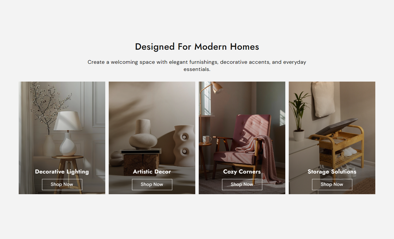
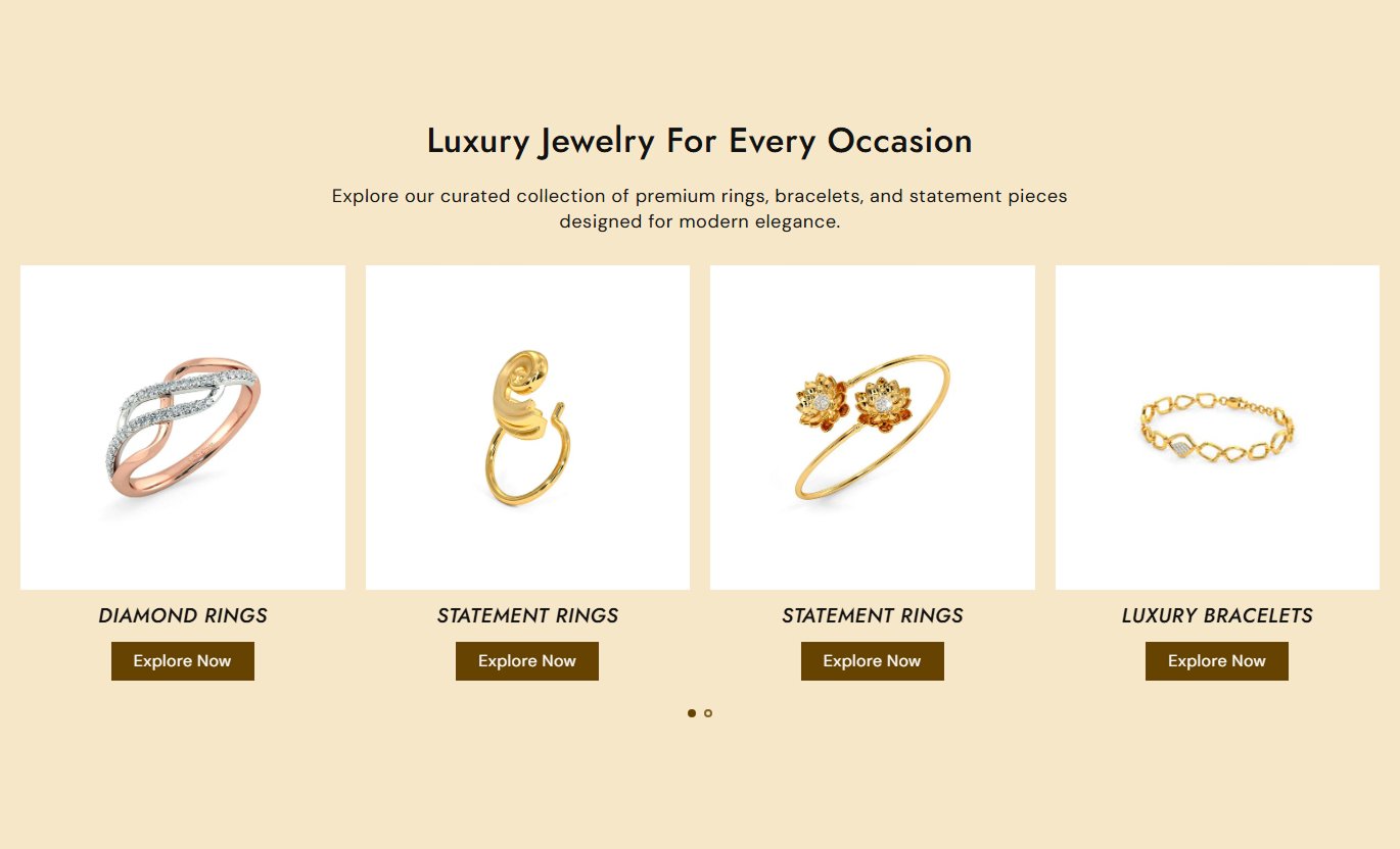
Showcase your most important collections on the homepage so visitors can quickly understand your product range and explore the categories that interest them.

Display featured collections in a clean grid or slider to help shoppers discover product categories and explore your store with ease.
 OS 2.0 Ready
Grid or Slider Layout
No Coding Needed
OS 2.0 Ready
Grid or Slider Layout
No Coding Needed 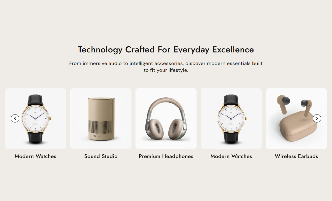


Present collections with flexible layouts, custom images, titles, buttons, responsive columns, and slider controls built for Shopify stores.

Choose a grid or slider layout to display collections in a way that fits your storefront.

Add custom images to give each collection card a unique visual style.

Use the selected collection's featured image when no custom image is added.

Add your own collection title or use the selected collection name automatically.

Choose the number of collection columns separately for desktop and mobile screens.

Choose Adapt to Image, Portrait, or Square to control collection card proportions.

Add a button to collection cards when you want shoppers to take a clear next step.

Enable arrows, dots, looping, and autoplay when using the slider layout.
Control collection layout, images, buttons, slider behavior, colors, spacing, and section width from the Shopify theme editor.

Applies to the whole section
Add the main heading for the collection section.
Section HeadingAdd supporting text below the heading.
Section ContentChoose how the section heading and content are aligned.
Text AlignmentChoose between grid and slider layouts.
Collection LayoutSet the number of collection columns on desktop.
Desktop ColumnsSet the number of collection columns on mobile.
Mobile ColumnsChoose how collection images are displayed.
Image RatioChoose where collection text appears.
Collection Text AlignmentShow collection titles over the image when enabled.
Content InsideSet the section background color.
Background Color
Applies to each slide
Add a custom image for the collection card.
Collection ImageEnter a custom title for the collection.
Collection TitleSelect the collection shown in the card.
Select CollectionUse collection cards to organize product categories and guide shoppers toward relevant parts of your store from key pages and shopping experiences.
Showcase your most important collections on the homepage so visitors can quickly understand your product range and explore the categories that interest them.
 Highlight your most important product categoriesGive new visitors a clear shopping starting pointMake collection discovery more visualOrganize products into easy-to-browse groupsCreate a stronger path into your store
Show related categories or featured collections to help shoppers discover more products after browsing a specific collection.
Introduce shoppers to related product categoriesEncourage further collection browsingMake category discovery more visualHelp shoppers explore more of your catalogKeep related shopping options easy to findAdd collection links near product content to help shoppers discover the wider range of products available in related categories.
Connect individual products with collectionsIntroduce related product categoriesEncourage broader store explorationGive shoppers more shopping directionsSupport product discovery beyond one itemUse collection cards on landing pages to guide visitors toward relevant product groups and make category selection simple after they enter your store.
Direct visitors toward relevant collectionsMake product categories easy to understandSupport focused campaign journeysAdd visual navigation to landing pagesHelp shoppers reach products fasterGive shoppers an easy way to browse product categories while keeping your storefront organized, attractive, and simple to navigate.
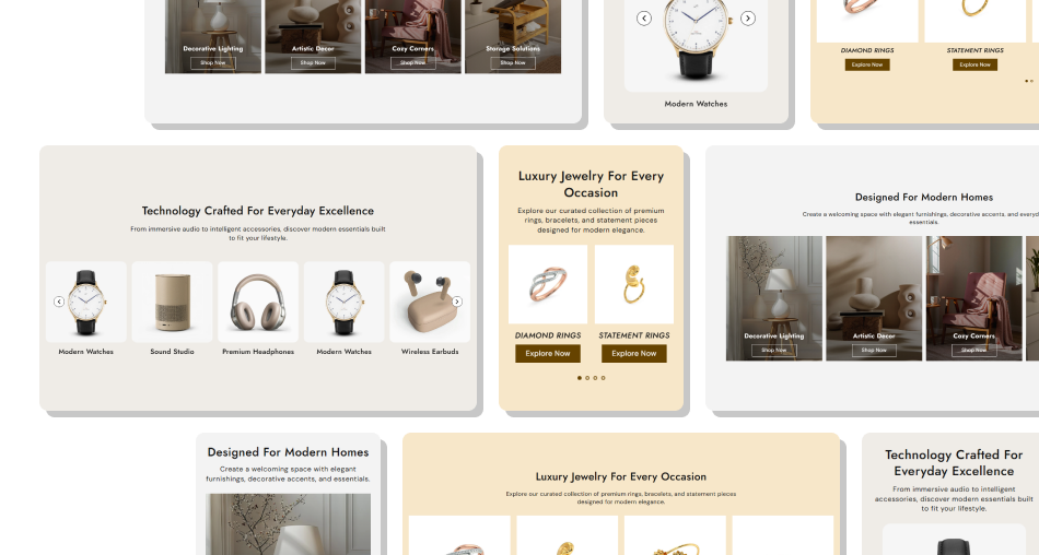
Help shoppers discover collections faster with visual navigation, flexible layouts, and a storefront experience that feels clear and easy to browse.
Improve Collection DiscoveryOrganize Your Product CatalogCreate Visual NavigationFlexible Store LayoutsSupport Mobile BrowsingMatch Your Store Design Use clear images that represent each collection
Keep collection titles short and easy to understand
Group relevant collections together
Use consistent image styles across collection cards
Check the layout on desktop and mobile
Use clear images that represent each collection
Keep collection titles short and easy to understand
Group relevant collections together
Use consistent image styles across collection cards
Check the layout on desktop and mobile  Don't use unrelated collection images
Don't add unclear collection titles
Don't mix inconsistent image styles
Don't overcrowd the collection list
Don't ignore the mobile layout
Don't use unrelated collection images
Don't add unclear collection titles
Don't mix inconsistent image styles
Don't overcrowd the collection list
Don't ignore the mobile layout Yes. Each collection block lets you select the collection you want to display.
Yes. You can add a custom image to each collection block. If no custom image is added, the selected collection's featured image can be used.
Yes. You can enter a custom title for each collection. If left empty, the selected collection title is used.
Yes. The section supports both Grid and Slider layouts. Slider controls include arrows, dots, looping, and autoplay.
Yes. You can set the number of collection columns separately for desktop and mobile layouts.
Yes. You can choose Adapt to Image, Portrait, or Square for collection images.
Yes. You can enable the button and add your own button label for the collection cards.
Yes. You can adjust desktop and mobile padding, enable Full Width, and set a custom maximum section width.
For Support or any Questions Email Us: [email protected]
Install SectionHub and add the Collection List section to your theme in minutes - no coding required.