Show the Transformation Behind Your Product
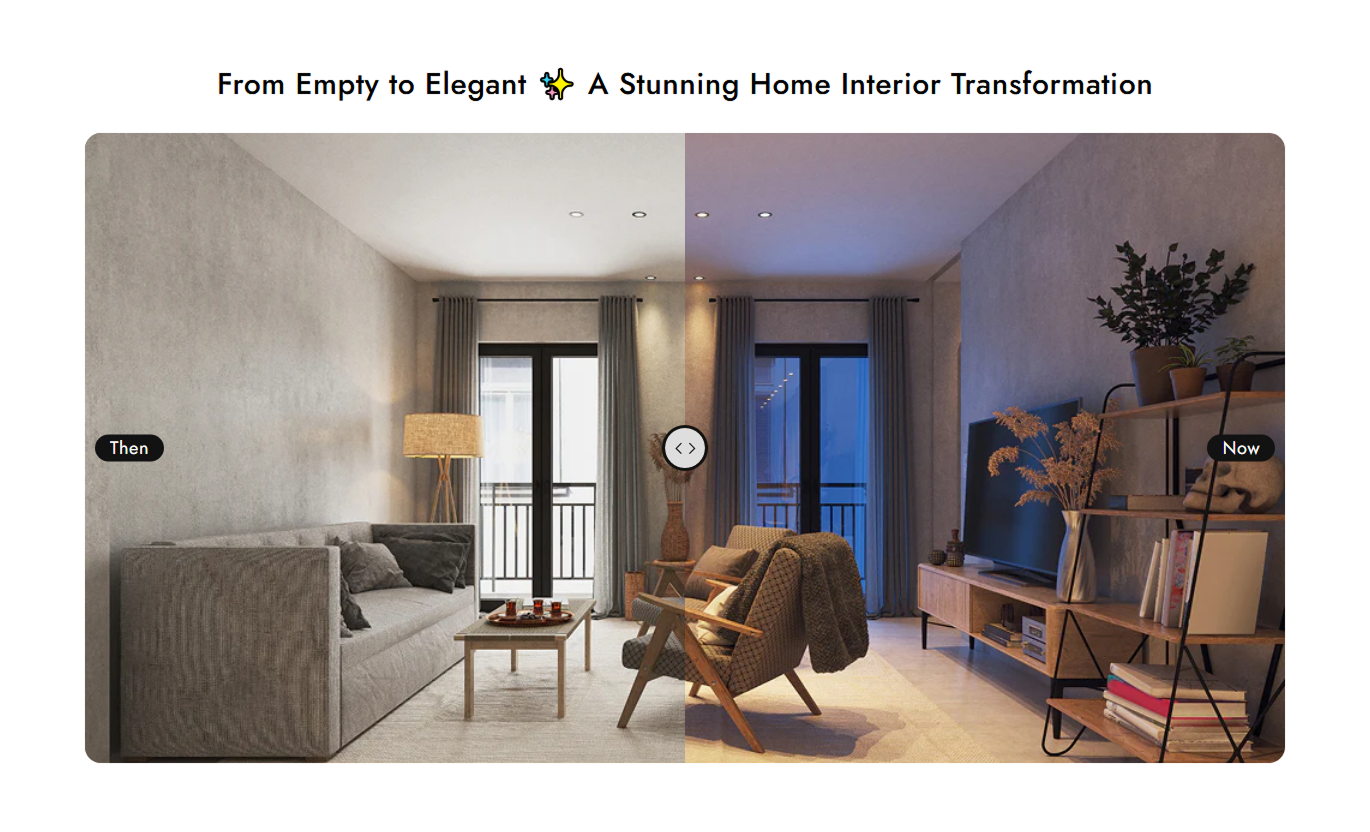
Show how your product improves, restores, or changes something with an interactive comparison that makes the result easy to understand.

Let customers compare results with an interactive Before / After slider. Showcase makeovers, restorations, upgrades, product results, and other visible transformations.
 OS 2.0 Ready
Interactive Comparison
No Coding Needed
OS 2.0 Ready
Interactive Comparison
No Coding Needed 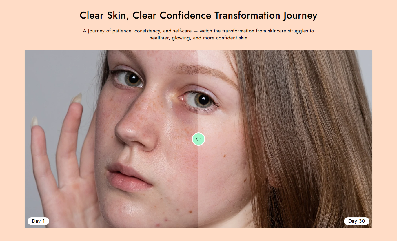


Help shoppers compare results with custom images, labels, image sizing, and a smooth draggable slider that makes transformations easy to see.

Drag the comparison handle to reveal each side of the image.

Upload separate images for the original and final result.

Add your own Before and After labels to match your content.

Create a smooth comparison experience across desktop, tablet, and mobile.

Choose the image height that best fits your store layout.

Place labels at the top, middle, or bottom of the image.

Adjust section, label, and comparison slider colors to match your store.

Customize the section directly from the Shopify theme editor.
Control your comparison images, labels, slider, and styling from one place.

Applies to the whole section
Main heading displayed above the comparison.
HeadingSupporting text displayed below the heading.
ContentChoose the alignment of the heading and content.
Text AlignmentImage shown as the original version.
Before ImageText displayed on the Before image.
Before TextImage shown as the final version.
After ImageText displayed on the After image.
After TextSet the comparison image height.
Image HeightRound the comparison image corners.
Media Border RadiusChoose where the Before/After labels appear.
Text PositionSet the heading font size.
Heading Font SizeSet the content font size.
Content Font SizeSet the Before/After label font size.
Before/After Text Font SizeSet the section background color.
Background ColorSet the heading text color.
Heading ColorSet the content text color.
Content ColorSet the label background color.
Label Background ColorSet the label text color.
Label Text ColorSet the comparison separator color.
Separator Background ColorSet the separator border color.
Separator Border ColorSet the separator arrow color.
Separator Arrow ColorSet desktop section spacing.
Desktop PaddingSet mobile section spacing.
Mobile PaddingMake the section span the available width.
Full WidthSet the maximum section width.
Section WidthUse an interactive comparison to show product results, transformations, and visual improvements wherever seeing the difference can help customers make a decision.
Show how your product improves, restores, or changes something with an interactive comparison that makes the result easy to understand.
 Show product results visuallyBuild purchase confidenceExplain product benefits clearlyHelp customers visualize results
Show impressive transformations on your homepage with an interactive comparison that quickly communicates what your product or service can achieve.
Capture attention quicklyHighlight impressive resultsAdd interactive contentCommunicate value visuallyAdd Before / After comparisons to help shoppers understand product benefits and see the results they can expect from your collection.
Add visual proofExplain product benefitsSupport product discoveryMake collections more engagingUse Before / After images for campaigns, launches, services, or promotions to show results and create a more memorable visual experience.
Communicate results quicklyStrengthen campaign messagingAdd interactive contentEncourage visitors to take actionGive customers an interactive way to compare results and understand product improvements across desktop, tablet, and mobile.
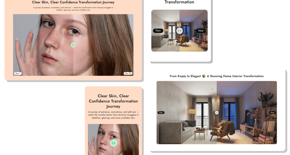
Make transformations easier to see and understand with a responsive comparison section built for modern Shopify stores.
Showcase real transformationsMake product benefits clearerBuild customer confidenceCreate interactive experiencesImprove visual engagementDeliver a better mobile experienceMatch your store branding Use high-quality images
Keep both images aligned
Show a clear transformation
Use simple labels
Keep framing consistent
Focus on one result
Use high-quality images
Keep both images aligned
Show a clear transformation
Use simple labels
Keep framing consistent
Focus on one result  Use unrelated images
Mix different angles
Use blurry images
Add unnecessary text
Make the comparison unclear
Overload the section
Use unrelated images
Mix different angles
Use blurry images
Add unnecessary text
Make the comparison unclear
Overload the section Yes. Upload one image for the original state and another for the final result.
Yes. Visitors can drag the comparison handle to reveal more of either image.
Yes. You can enter custom text for both labels and choose their position on the image.
Yes. Use the Image Height setting to adjust how the comparison fits your layout.
Yes. You can change the section, text, label, and comparison slider colors.
Yes. The comparison adapts to desktop, tablet, and mobile screen sizes.
Yes. Separate desktop and mobile padding controls let you adjust the section spacing.
Yes. Enable Full Width or set a custom maximum section width from the theme editor.
For Support or any Questions Email Us: [email protected]
Install SectionHub and add the Before / After Image section to your theme in minutes - no coding required.